The Live Form Editor in BookingHub lets you create and customize booking forms visually, with instant live preview. Whether you’re managing service bookings, events, rentals, or hotel reservations, this editor gives you complete control over your form’s content, style, layout, and structure.
🛠️ How to Use the BookingHub Live Form Editor
1. Open the Live Form Editor
Navigate in BookingHub to Appointment Forms page (or Reservation Forms) and click Add Appointment Forms.
The interface has three columns:

Left Sidebar: Tabs for Form, Style, Steps, Settings
Center: Live preview reflecting changes instantly
Right Sidebar: Contextual options per tab
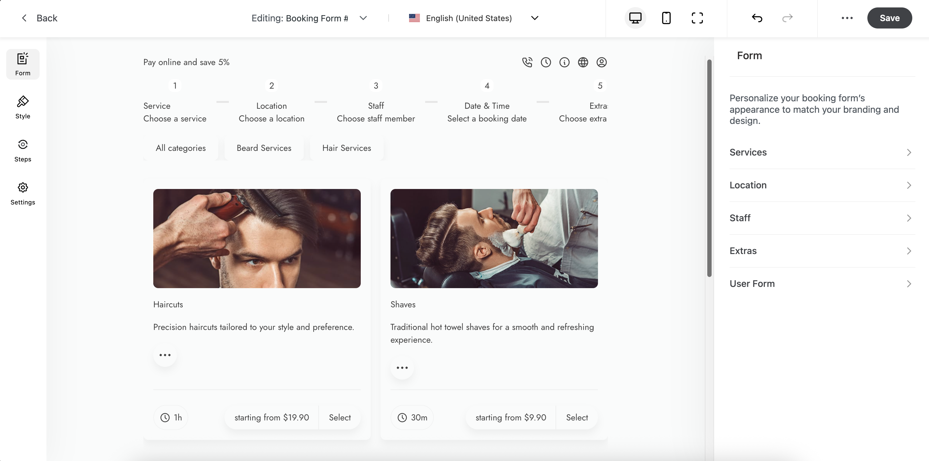
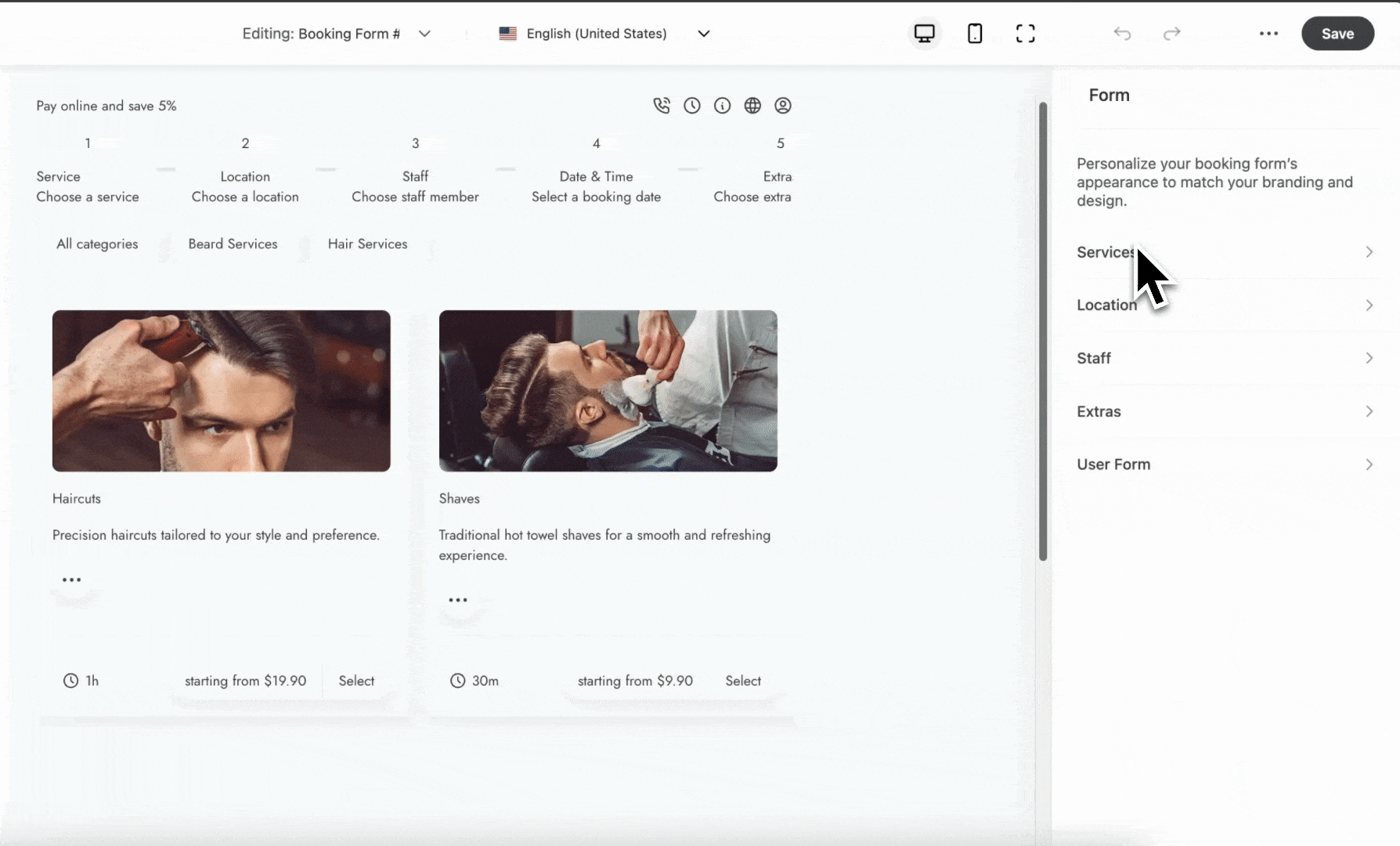
2. Form Tab – Build Your Form Structure
Inside the Form tab, add main content sections:
Services, Locations, Staff, Extras
User Form: edit customer info fields like name, email, phone
Select which services, extras, or staff to let users book
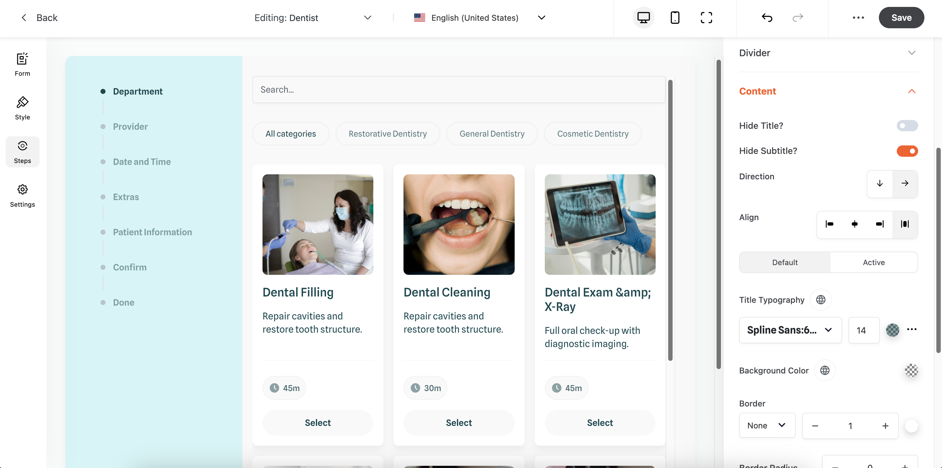
3. Style Tab – Customize Visual Design
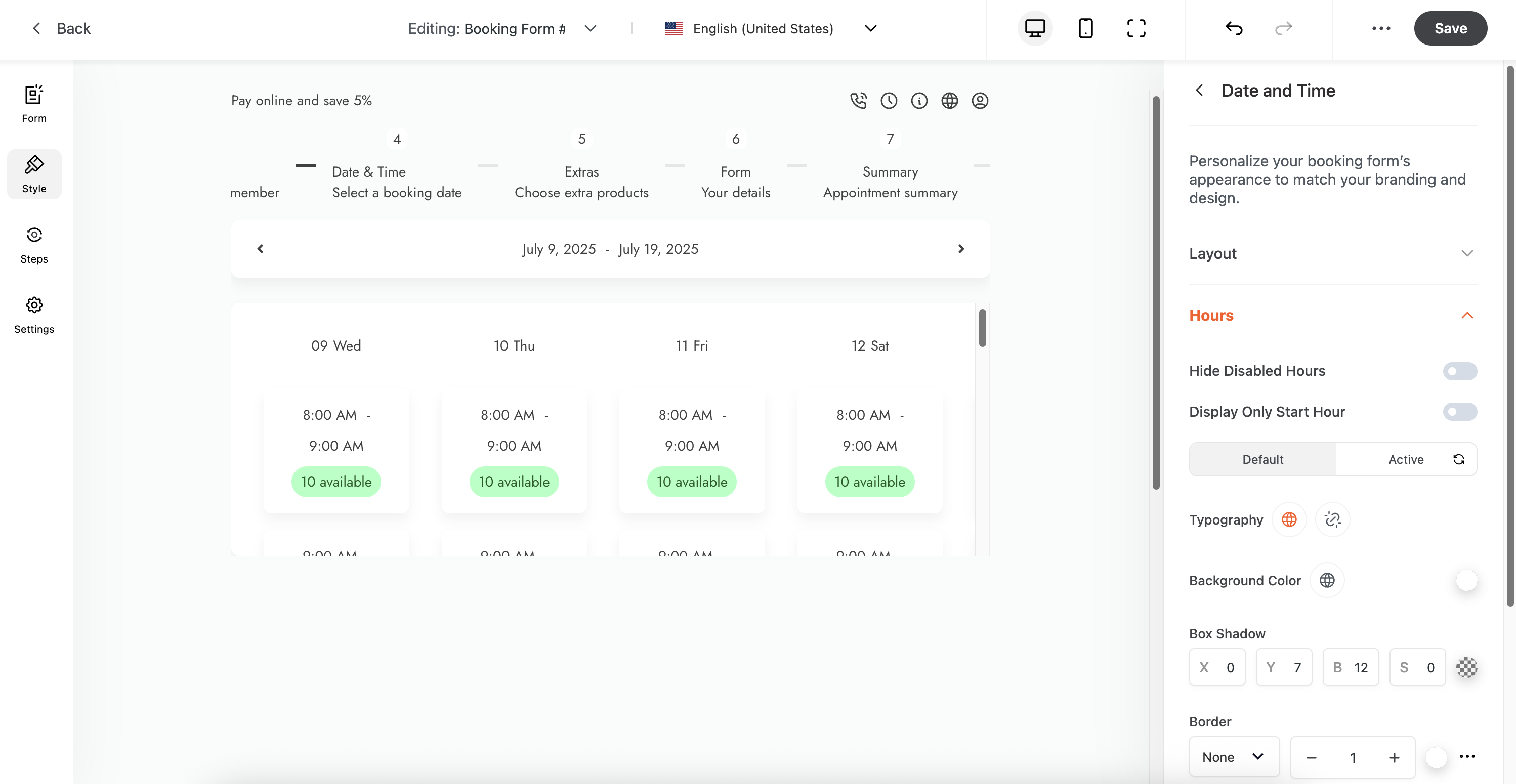
Use the Style tab to alter:
Colors: background, inputs, buttons, labels
Typography: fonts, sizes, weights, spacing
Spacing: padding and margins
Layout: width, alignment, field positioning
Preview updates appear instantly
4. Steps Tab – Configure Multi‑Step Flows
Enable or disable booking steps you want to include
Rearrange or rename steps for clarity
Style the stepper: choose orientation (horizontal, vertical), change active/inactive colors, icons, progress bar appearance
5. Settings Tab – Control Layout & Behavior
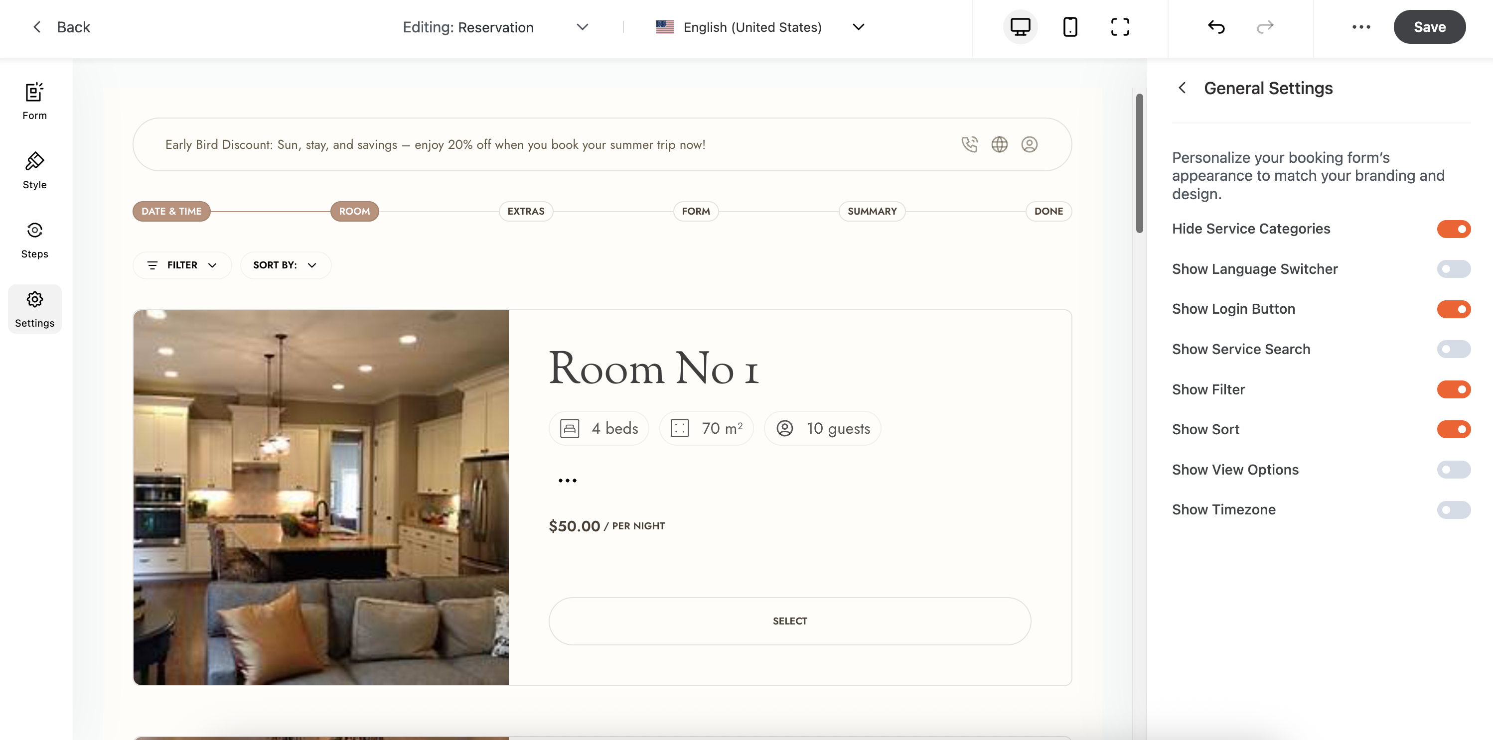
Form Display:
Choose dimensions and display style: Default, Lightbox (modal), or Side‑Modal
Visibility Options: toggle elements like:
Service categories, language switcher, login button, filters, timezone display
Extras:
Enable an Info Box with extra info
Show a Summary Sidebar with booking details
Import/Export settings to copy configurations
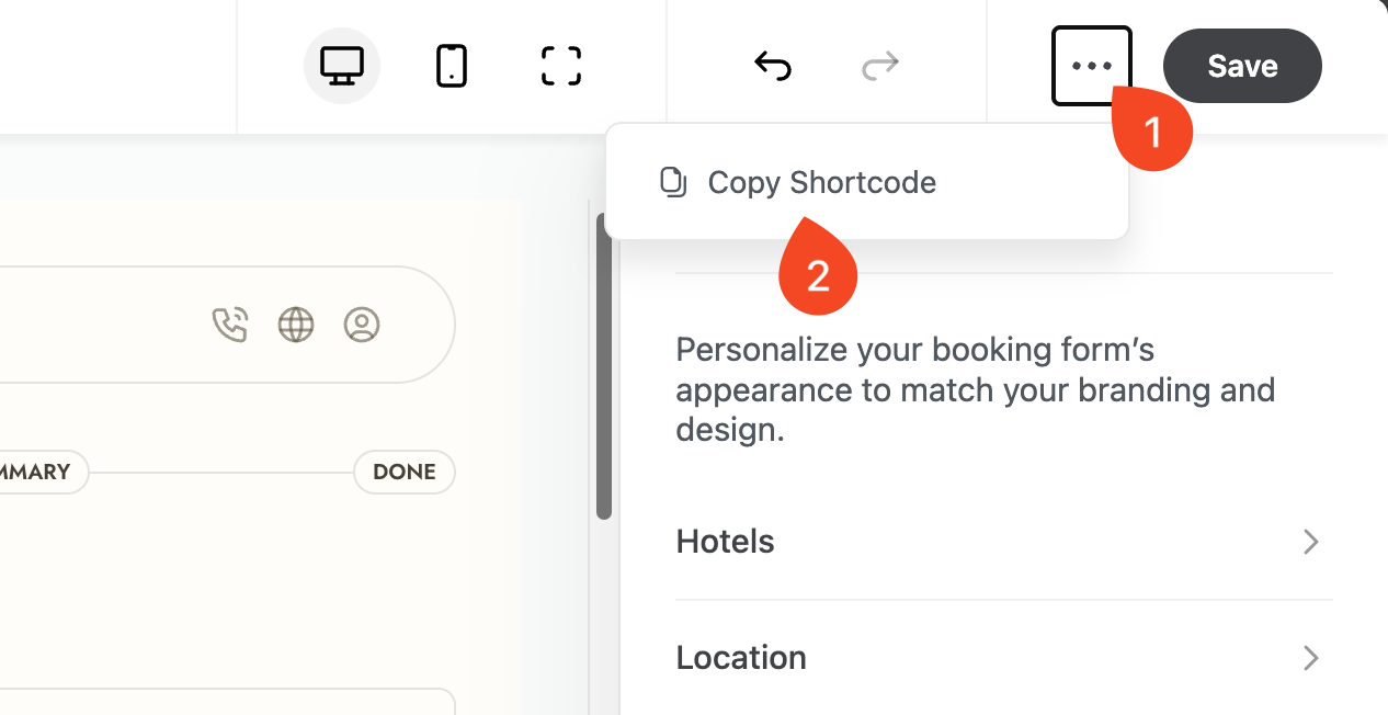
6. Save & Embed Your Form
Click Save (top right)
To embed: click the three‑dots icon next to Save → copy the shortcode

Paste this shortcode into a page, post, or widget to display your form
✅ Best‑Practice Checklist
Assign at least one service, location, and staff member
Align style with your brand via the Style tab
Test on both desktop and mobile devices using live preview